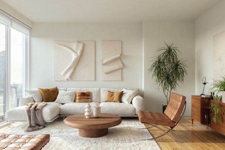
When it comes to design and decorating, there are countless ways to add character to a space… an oversized mirror, an accent chair, or a unique light fixture. But few things can make as impactful a change as a fresh coat of paint. The colour of a room has the power to influence our mood and the emotions we feel when we’re in it.
Much like fashion, paint colours come in and out of style. Each year, colour experts set the trend for the hottest colours of the season. Across the board, the colours of 2021 are meant to evoke feelings of calm, comfort, serenity and an attachment to the natural world; quite fitting in these times of a seemingly endless pandemic.
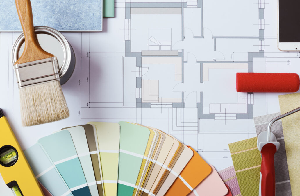
Here are the 2021 colours of the year, according to some of the top paint companies in North America:
Pantone’s colours of the year are a pair of complementary tones. Ultimate Gray (PANTONE 17-5104) + Illuminating (PANTONE 13-0647) are two colours meant to symbolize warmth and optimism. The grey is strong and grounding, while the sunny yellow tone helps us imagine brighter days ahead.
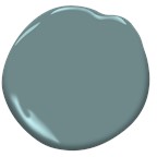
Benjamin Moore’s colour of the year is perfect for a show-stopping kitchen or a modern office. Aegean Teal (2136-40) may seem intense at first, but sit with it for a moment and this soft and comforting shade inspires a sense of relaxation and mindfulness.
Sherwin Williams’ colour of the year, Urbane Bronze (SW 7048), is a deep and warming tone that invites you in from the cold and envelopes you in comfort. Its grey undertones give it a modern edge. If you find it’s too dark for an entire room, consider using it for an accent wall.
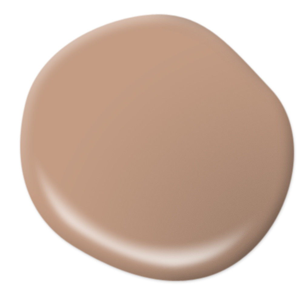
Behr’s colour of the year is Canyon Dusk (S210-4). Its name truly says it all. This beautiful sandy shade is tranquil and grounding. It makes us feel like we’re in the desert with no cellphone reception.
Glidden’s colour of the year, Aqua Fiesta (PPG1147-4), is fresh and tropical. The marine tone is reminiscent of the crystal clear waters of the Caribbean. How’s that for calming?! And, if you’re not comfortable using this shade on your walls, you can brighten any neutral room with accessories like curtains or accent pillows in this bright and welcoming colour.
Valspar has developed an entire collection of 12 colours for 2021, created to make any room feel cozy and comfortable. And that’s precisely what they do. From cool blues and soft greys to modern shades of rose and taupe, this collection can be mixed and matched to give any space a calming feel.